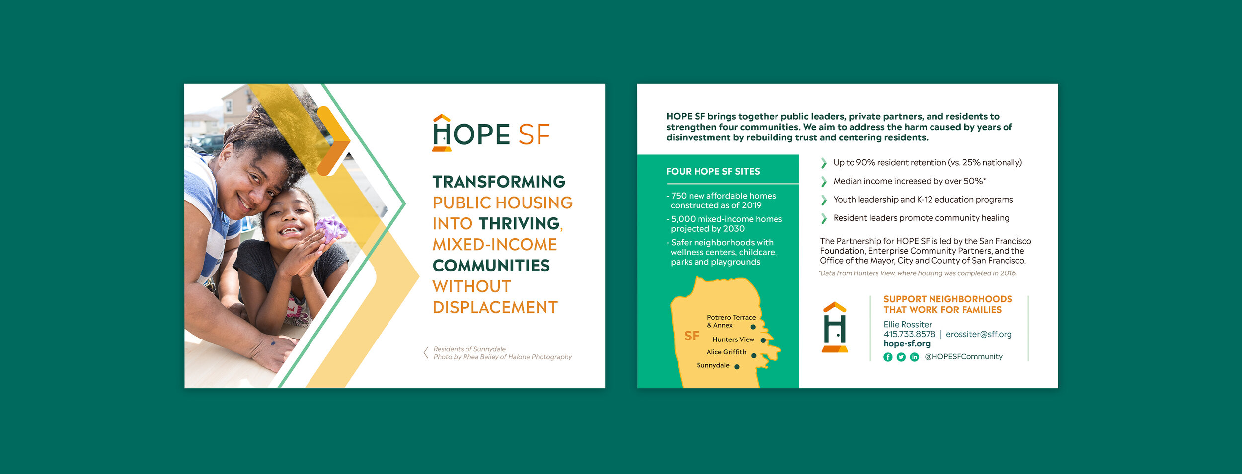
HOPE SF
HOPE SF is a large-scale community development and reparations initiative creating vibrant, inclusive, mixed-income communities in San Francisco without displacing original residents. Their holistic, resident-driven change model continues to succeed in transforming distressed public housing sites into healthy, thriving neighborhoods.
As part of my in-house role at the San Francisco Foundation, I designed a new visual identity system for HOPE SF to position them as a welcoming, contemporary organization in preparation for their 10 year anniversary.

Welcome home
While HOPE SF speaks to many different audiences (city officials, corporate funders, property developers, nonprofits, SF residents of all income levels), their top priority in the redesign was continuing to build trust with public housing residents and partnering with them to create a culture of inclusion and belonging in these historically isolated communities.
The new visual identity takes inspiration from the joy and comfort of having a place to call home, incorporating elements that are a nod to stability, ownership, and community.


HOPE SF’s previous logo was similar to Habitat for Humanity and wasn’t used broadly, even on their own marketing materials. The submark H gives the organization an ownable, memorable, flexible symbol of the program.
We communicated with residents and community leaders throughout the process to get their feedback and ensure the brand struck the right tone.

Creating the system
As a close and equal partnership between SFF, the SF Mayor’s Office, and Enterprise Community Partners (a property developer), HOPE SF needed a clearly-defined identity system that would differentiate it from those parent entities while being easy to use for staff at multiple organizations. I worked closely with all the partners to create something that spoke to their common goals.
The identity system includes a toolkit of supporting elements and style cues that define the new look of communications, including a bright and cheerful color palette, a mix of modern geometric sans with brush script accents, an icon system constructed around the “welcome mat,” and a layered arrow treatment.


Website
Based on the style guidelines I created, the team at ondesign designed and developed a completely-revamped site to bring HOPE SF’s digital presence into the 21st century.

Small touches
As part of our imagining of how residents would start seeing HOPE SF show up in their communities, I designed branded items such as pins (for pride or function), welcome keychains for residents, and distinctive hard hats for construction workers and community groundbreaking ceremonies.


